
ArtRage
About ArtRage
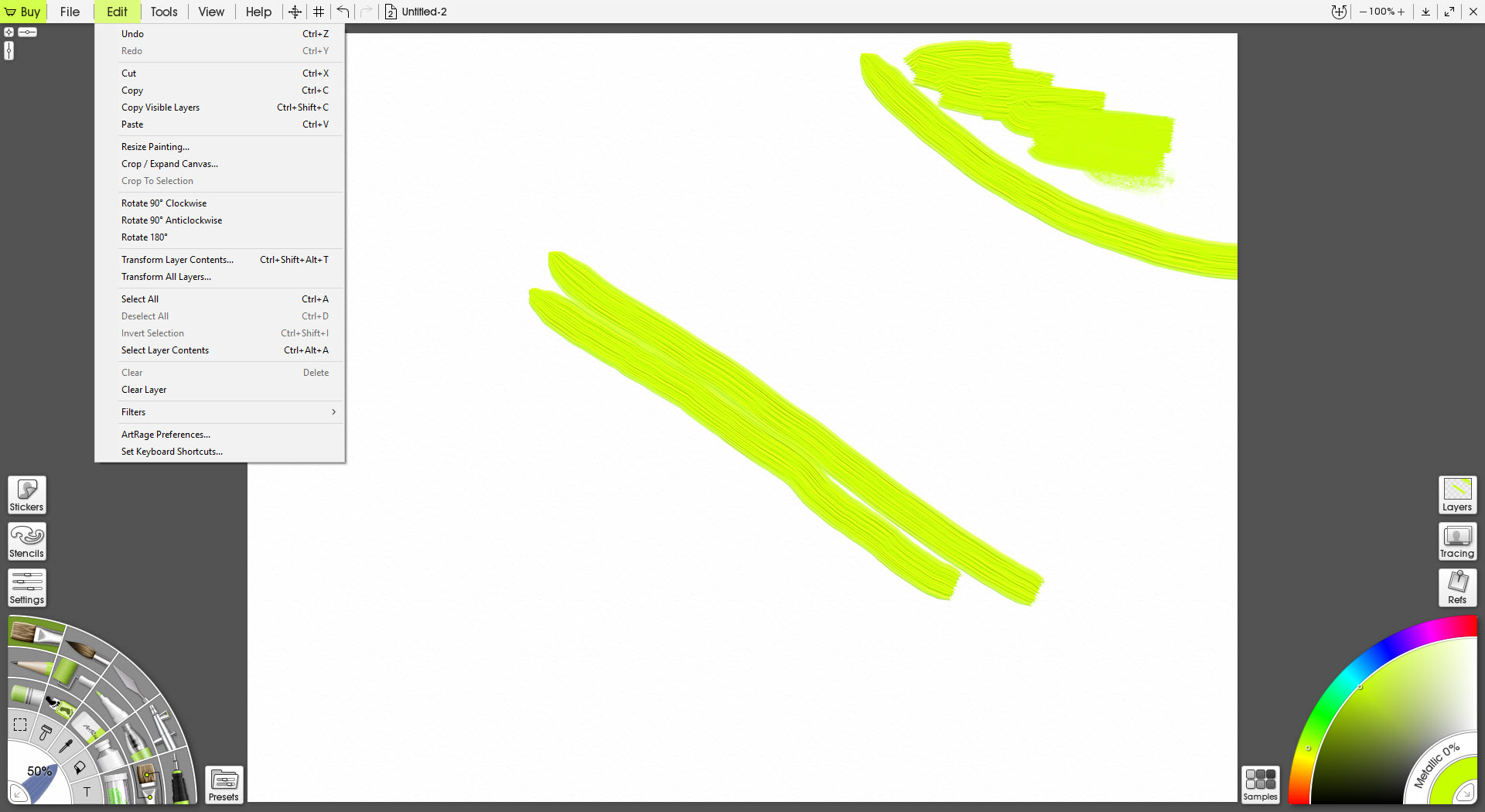
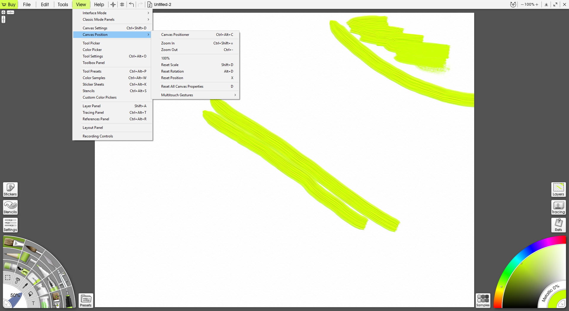
ArtRage paints with paint rather than with pixels. Load the oil brush, drag it across the canvas, and the stroke carries a measured amount of paint that thins as the brush runs dry, piles into ridges where strokes cross, catches the canvas light on its raised edges and smears into the colour already there when a palette knife passes over it.
Watercolour bleeds and pools according to how wet the paper is, and pencil grain follows the texture of the sheet, a feel that a sketching application built around brush response chases from the drawing side. The program keeps track of how much paint sits on every point of the canvas, how wet it is and how thick, and every tool reads that state before it leaves a mark.
That physical model is the reason the program exists and the reason it looks like nothing else. Most digital painting applications simulate the appearance of media with clever brush tips. ArtRage simulates the media themselves, and the difference shows in the way colours mix on the canvas rather than in a picker, in the way a glazed layer of thin oil sits over an impasto one, and in the way a beginner’s first attempt looks like a painting rather than a drawing.
Around that core sit the digital conveniences, from layers to stencils to tracing images, and a workbench interface that folds away so the canvas fills the screen. The current edition carries the name Vitae on the box.
Tools that behave like themselves
The oil brush is the heart of ArtRage. Thickness, loading, how quickly the brush runs out, how much it blends with what is under it and how much texture the bristles leave are all settings, and the stroke’s gloss and impasto depth catch the adjustable canvas lighting.
The palette knife spreads and smears the paint already on the canvas, which is how colours are mixed in this program, on the surface rather than in a dialog. The paint tube squeezes a blob to be worked, and the watercolour brush soaks into the paper and bleeds at its edges, drying over time.
Pencils shade with the side of the tip and respond to canvas grain, pastel crumbles, the felt pen and the ink pen draw clean lines, and a gloop pen draws thick liquid strokes that merge. Each tool stores presets, and the presets panel is where a painter’s own brushes accumulate.
Real colour blending mixes pigments the way they mix physically, so blue and yellow make green rather than the muddy grey plain digital averaging gives.
The canvas and its light
The ArtRage canvas is a material with settings of its own. Grain and roughness, a metallic sheen and a colour define a surface from smooth paper to coarse linen, and canvas presets save a favourite. A light source sits above at an adjustable angle and intensity, so thick strokes cast real shadows and glossy ones catch highlights, and rotating the light changes how a finished painting reads in a way flat software cannot.
Because paint has depth, a painting rendered on a rough canvas looks different from the same strokes on a smooth one, and switching the canvas after the fact re-lights everything.
That depth does not survive export, since exporting flattens the lighting into the image, so the texture that looked alive on screen becomes a fixed appearance in the file. A painter who intends to print chooses the canvas and the light before the final export.
Tracing and the digital kit
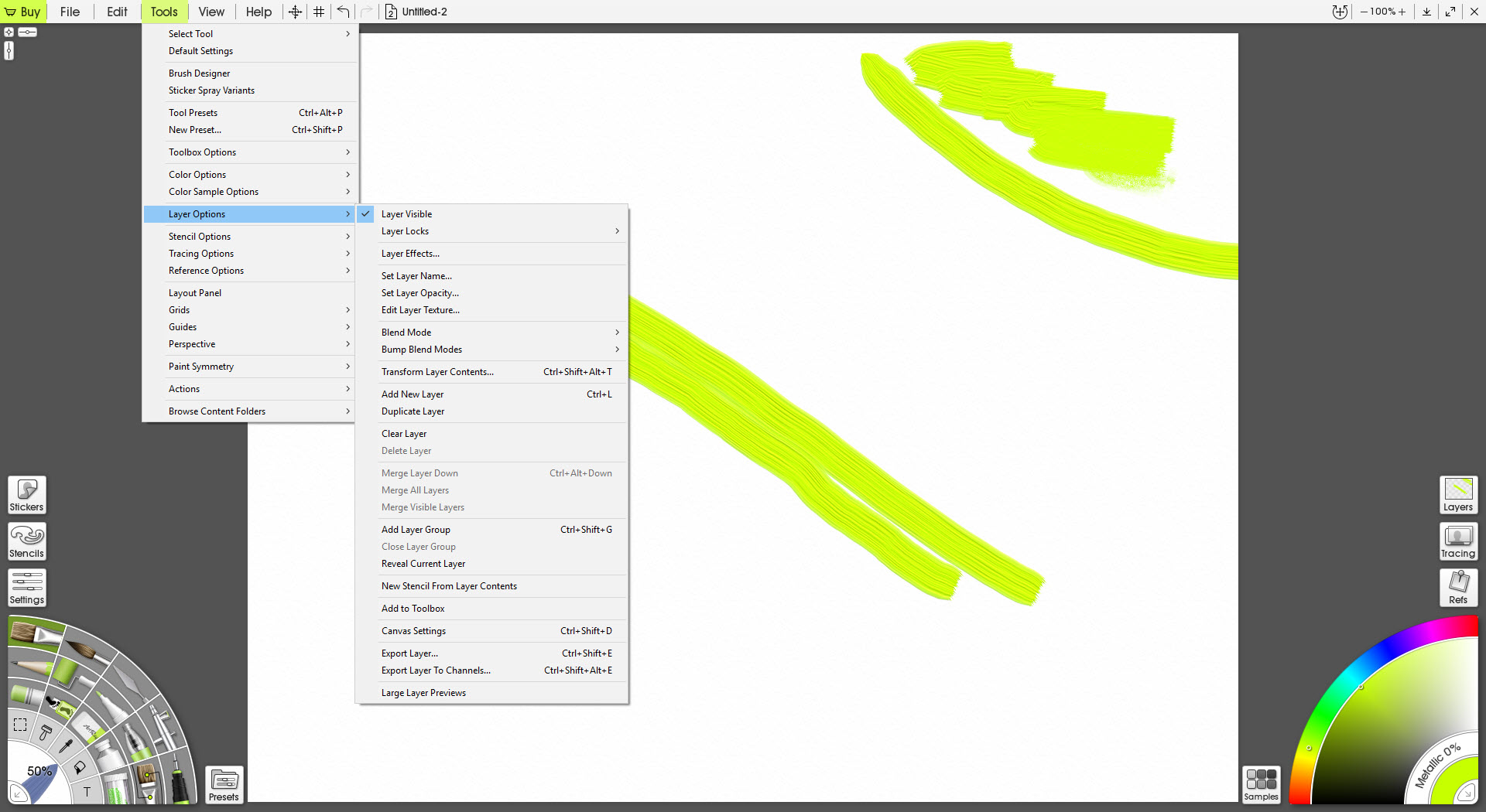
ArtRage layers behave as painters expect, with blend modes and groups, and the paint on each layer keeping its own thickness, so a glaze on an upper layer sits over the texture below. Stencils mask areas with built-in shapes or your own, perspective guides draw vanishing lines, symmetry mirrors strokes across any number of axes, and a cloner tool paints with the colours of a loaded image.
Tracing is the beginner’s bridge. Import a photo as a tracing image and it shows faintly under the strokes, with an option for the brush to pick its colour automatically from the photo beneath, so a first portrait becomes an exercise in brushwork rather than colour theory. Reference images pin to the canvas edge.
Files save in the program’s own format with everything intact, and open and export as PSD with the layer structure preserved for finishing in a general image editor.
The interface, and painting on a tablet
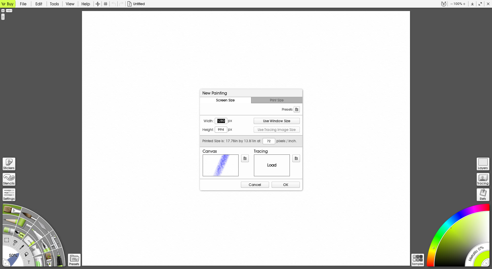
The default ArtRage view is a canvas with a tool pod in one corner and a colour pod in another, and both pods expand into panels when needed and fold away when not, so the painting takes the screen. A classic layout with panels docked around the edges suits a large monitor, and the two switch from a menu. Pressure and tilt from a pen drive thickness and angle on the tools that use them, with barrel rotation where the pen offers it, and the program has long been tuned for pen tablets, with pen displays and touch gestures handled in the current edition.
The interface is friendly to a degree that makes professionals suspect it, and that suspicion is unfair to the simulation underneath. Where it is fair is in the digital tooling, which is thinner than a painter coming from Krita expects, with fewer brush engines, no animation and a selection toolkit that does the basics. This is a painting room, not an illustration workshop, and it is honest about which.
Where the simulation stops
Large ArtRage canvases with thick paint make demands, since the program tracks depth and wetness for every point, and a very large painting slows on a modest machine where a pixel-only editor would not. The physical model that makes oils convincing also means some digital habits do not work, a copied layer carries its paint and lighting with it, and a transform of a thick stroke can look wrong until it is repainted.
Watercolour, while good, is a step behind the dedicated watercolour simulators. And the tool set is finite, a dozen or so media that behave like what they are rather than hundreds of brush engines.
Conclusion
ArtRage suits painters who miss the behaviour of real materials and want oils that pile and smear, watercolour that bleeds and pencils that catch the grain, from beginners tracing their first portrait to traditional artists working without the solvents. The physical simulation is the most convincing in its class for oils, the canvas and lighting make a painting feel like an object, and the interface stays out of the way.
It is not an illustration workshop, and its depth slows big canvases while its export loses the lighting. Choose the canvas and the light before the final export, keep a pixel editor for the finishing, and paint here for the pleasure of paint behaving like paint.
Pros & Cons
- Simulates paint thickness and wetness over a textured canvas so colours mix on the surface
- Oil brush with impasto and gloss that runs dry, plus a palette knife that smears real paint
- Canvas as a material with grain and sheen under an adjustable light
- Tracing images with automatic colour picking for beginners
- Layers with blend modes, plus stencils, perspective guides and symmetry
- PSD import and export with the layer structure intact
- Large canvases with thick paint slow on modest machines
- Digital tooling is thinner than illustration-focused editors
- Export flattens the canvas lighting into the image
- Watercolour trails the dedicated watercolour simulators
Frequently asked questions
It tracks how much paint is on every point of the canvas, how wet and how thick, and every tool reads that before it marks, so strokes pile and smear physically under adjustable lighting.
Yes. A tracing image shows a photo under the canvas and can pick each stroke's colour from it, so a beginner practises brushwork while the colours look after themselves.
Yes. Pressure and tilt drive the tools that use them, with barrel rotation where available, and pen displays and touch gestures are handled in the current edition.
Yes. Export to PSD keeps the layer structure, and the native format keeps the paint depth and lighting for reopening here.


