

Mockplus
About Mockplus
Mockplus turns a sketch of an app into something you can tap through before anyone writes code. Drag components from a library onto a page sized for a phone, a tablet or a browser, give each one a label, then drag a link from a button to another page and the prototype knows where that button goes. Preview on the desktop or on a phone, and the screens respond to taps and swipes, with timed animations, as the finished app would. The result settles arguments about flow and layout before a programmer builds the wrong thing.
The desktop edition works offline and keeps projects as local files, with team features through a connected workspace for groups who want them, and a browser-based sibling covers the same ground online for teams who live there. Components number in the hundreds, with icons in the thousands and a template library of complete screens for common app patterns.
Mockplus aims at speed over fidelity. Its prototypes look like wireframes with some polish rather than pixel-perfect designs, and the interaction model trades fine control for the ability to wire up a whole app’s flow in an hour, which is the right trade for the early stage it serves.
Pages and the component library
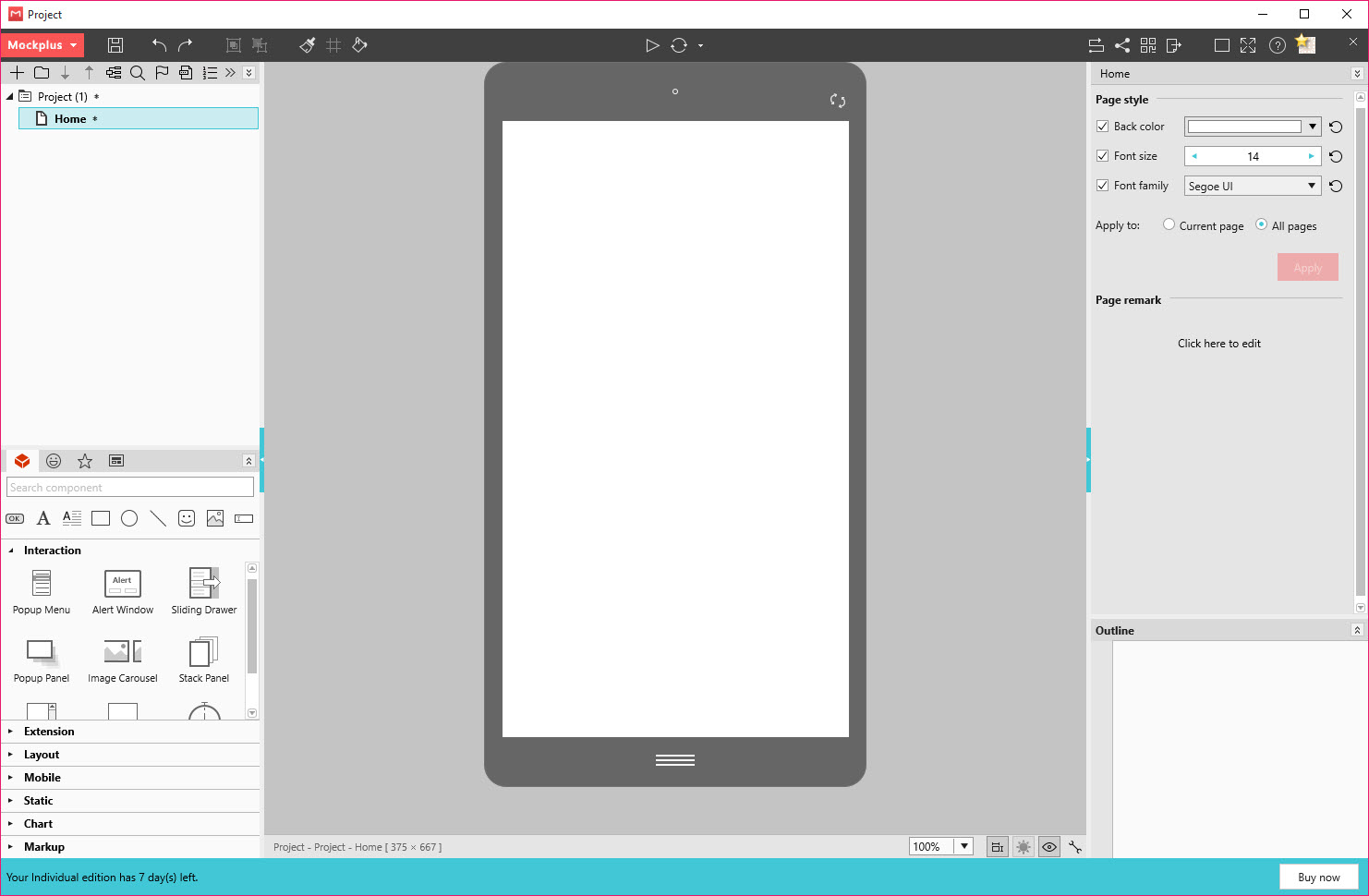
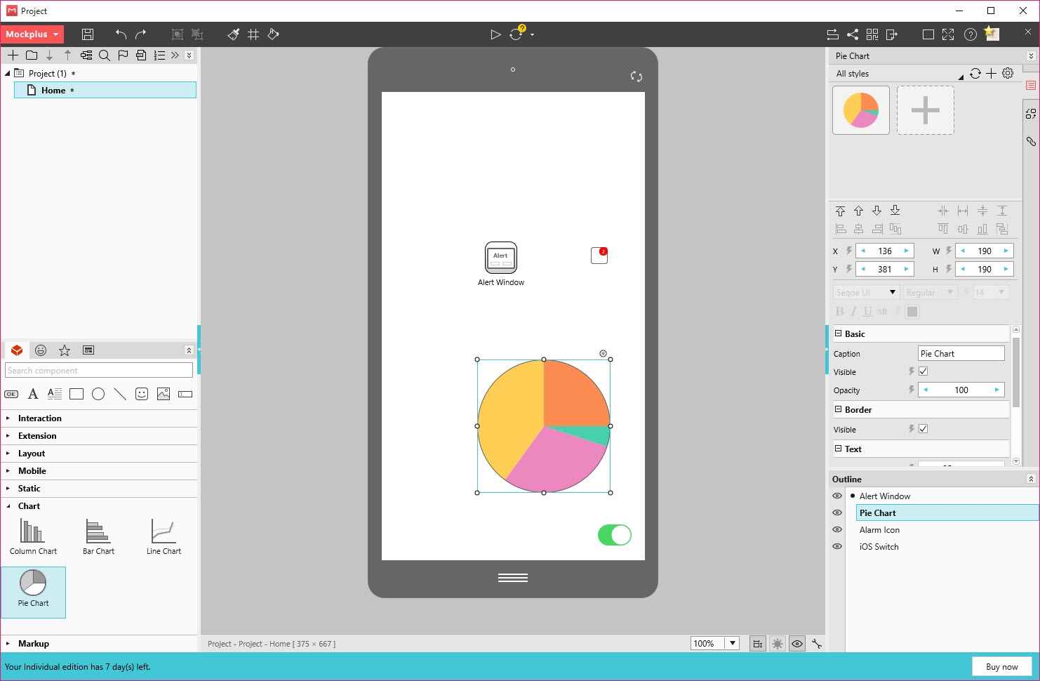
A Mockplus project is a set of pages at a device size you choose, with templates for every common device from phones to web layouts, each carrying the right dimensions and status bars. The component panel holds the building blocks of an interface, buttons and inputs, lists and navigation bars, images and charts and more, each dragged onto the page and resized by its handles, with properties such as text and colour, and the component’s state, in a side panel. Components snap to guides, and alignment tools tidy a layout in a click.
Icons come from a library of several thousand, recoloured in place, and complete page templates give a login screen or a feed in one drop. Libraries of your own components save for reuse across projects, and a team shares them so every screen uses the same header.
For a vector illustration that no component covers, Inkscape draws it and it imports as an image.
Interactions by dragging a link
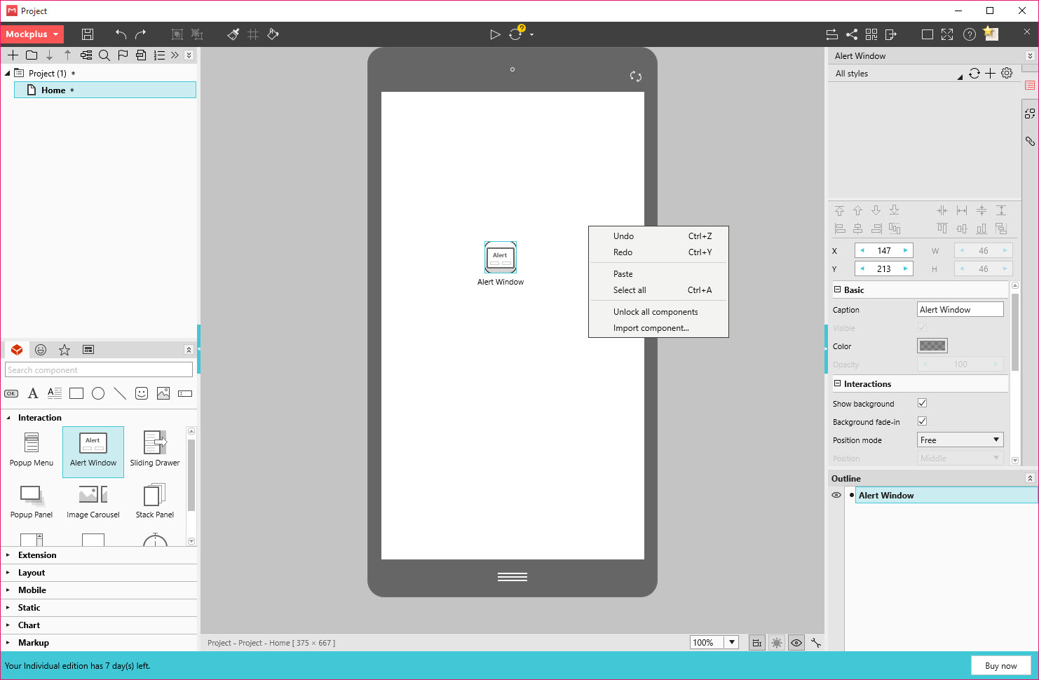
Interaction is the part of Mockplus that separates a prototype from a picture. Select a component and a small link handle appears. Drag it to another page and a transition is created, with a chooser for the trigger, tap, double tap, long press or swipe, and for the animation, slide, fade, zoom or flip, with direction and duration. Drag it to another component on the same page and the action becomes show, hide, move, resize, rotate or change state, which is how a menu slides out or a tab switches without leaving the page.
Several actions can run in sequence or together from one trigger, and interaction states give a component a different look when pressed or selected. Ready-made interactive components such as a drawer, a pop-up and a carousel come with their behaviour already wired, so a sliding menu is a drop rather than a dozen links.
It is quick to build and quick to change, and the trade for that speed is that logic beyond the basic actions, such as conditions and variables, is thin.
Reusing work with masters and repeaters
A Mockplus master is a group of components saved once and placed on many pages, so a navigation bar edited in the master changes everywhere. Repeaters duplicate a cell, a list row or a card, across a list or a grid with one gesture, and auto data fill drops names, dates, numbers or images into the copies so a list looks populated rather than lorem ipsum. A style library keeps colours and text styles consistent.
Those tools are what turn a dozen screens into a hundred without a dozen hours, and they are the features that experienced users lean on most. Together with the templates they make the tool quick to learn, since the first prototype is largely assembled rather than drawn.
Mind-mapping the structure before drawing a single screen is a job for XMind, and this tool begins where that outline ends.
Previewing and sharing the prototype
Mockplus previews the prototype in a window on the desktop or in a companion app on a phone, where the screens respond to real touch at real size, which is the only honest way to judge a mobile layout. Export produces an HTML package that opens in any browser with the interactions working, or an image set of every page. A link shares the prototype for others to tap through and comment, and the connected workspace adds review and annotations, plus a hand-off view where a programmer reads measurements and copies assets.
That hand-off is where the design-to-build gap closes. Measurements and colours, along with text styles, are inspected on the finished screens, and the flow between them is visible as a map, which is also where a flowchart editor does a more rigorous job if the flow itself is the deliverable.
Teams and the shared workspace
A Mockplus team project puts several people on the same prototype, with members invited and roles set, and component and style libraries synchronised so everyone draws from the same parts. Changes sync through the workspace, notifications tell members what moved, and the project switches between personal and team modes with a click. A solo designer needs none of it, and a product team gets a prototype the whole group can open rather than one that lives on a laptop.
Where it stops
Fidelity is the Mockplus limit. The components look like good wireframes, not like a finished visual design, and anyone who needs the prototype to match the final pixels will move the screens to a visual design tool once the flow is agreed. Interaction logic stops short of conditions and variables, and of real data, so a prototype cannot branch on what the user typed.
The desktop edition trails the online sibling, which receives new features first, and the full libraries, team features and exports sit behind the paid tiers. For building the actual pages once the design is settled, Pinegrow Web Editor takes over where the prototype leaves off.
Conclusion
Mockplus suits product teams and solo designers who need to agree how an app flows before anyone builds it, and who value a prototype assembled in an hour over one polished for a week. The link-dragging interactions, the masters and repeaters and the phone preview get a tappable prototype in front of people fast, and the team workspace keeps everyone on the same screens. Startups testing an idea on users and agencies showing a client the shape of an app before a quote get the most from the speed.
It is not where final visuals get made, and it cannot imitate real logic. Use it for the flow and the layout, test on a phone early, and hand the agreed screens to a visual design tool and the build team once the arguments are settled.
Pros & Cons
- Drag a link from a component to a page and the interaction is wired
- Hundreds of components, thousands of icons and complete page templates
- Masters and repeaters with auto data fill scale a dozen screens to a hundred
- Preview on a phone at real size through the companion app
- HTML export runs the prototype in any browser with interactions intact
- Team libraries and roles through the connected workspace
- Wireframe-level fidelity rather than finished visual design
- No conditions, variables or real data in interactions
- Desktop edition trails the online sibling in new features
- Full libraries, team features and exports need the paid tiers
Frequently asked questions
Yes. A companion app previews the prototype at real size with real touch, and an HTML export runs in any phone browser.
No. Interactions cover navigation and visibility plus movement and state changes, but not conditions, variables or user data.
Yes. Save it as a master and place it on every page. Editing the master updates all of them.
Yes. The desktop edition keeps projects as local files and works without a connection, with team features through the connected workspace when needed.


